Case Study
UI/UX Form Conversion
Introduction
Westchester Family Care was a long-standing client of my former employer. They reached out to us with online lead conversion issues. They were unsure what was leading to the high form abandonement numbers they were seeing as per their Google Analytics. The project was presented to my team and together we took a deep dive into the numbers and the design.
Focal points for the form analysis;
- Could any form fields be removed
- Is there anything confusing about the submission process
- Can we incentivize end users to submit the form
- Can we provide information that would evoke feelings of trust

Getting Started
When my SCRUM team members met to discuss the project and strategize how best to rectify the form abandonement issues, there were various theories and ideas. Let's make the form shorter. Let's make it a two step form. Let's not require any of the form fields. The list went on and on. After some time, we realized that the contact form was missing the "trust" factor that would help carry end users through to conversion. We were missing the human element.
How could we add the "human" factor to the page?
- Do we add an image?
- Can we somehow customize the form user experience?
- How do we convey the idea of trust? Empathy? Understanding?
Research & Strategy
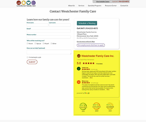
After several minutes of discussion, we realized we were overthinking. Let current clients of WFC do the work for us. Let's add a testimonial section to the contact page. We took it one step further and added the Best of Home Care awards section beneath that links to the verifying authority for additional credibility.
It made sense for several reasons;
- Internally, the team admitted to often using testimonials to help make a decision
- Word of mouth advertising is credible, more believable
- End users need to hear from other people in their difficult situation
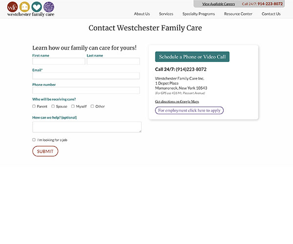
Before

After

Results

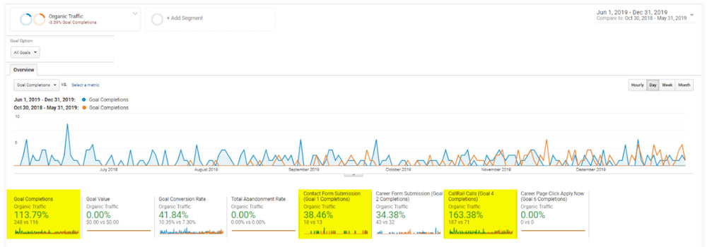
As the data shows below, the results were outstanding. Organic goal conversion increased 113% and after adding the testimonial and awards section, phone calls via the contact page increased 163%. The project might have seemed simple in theory, but was a great reminder of what so many online products, SaaS solutions, websites and user interfaces are missing; human centered design.

Get in touch

I work as a freelance designer in all of the above fields. If you’d like to discuss a project in more detail, feel free to drop a line. I love talking design.