UI/UX Design: Website Redesign
Research, Strategy & Design
Introduction
For quite some time, I felt that my online portfolio was a bit confusing and not indicative of the work I do or am capable of. I fell victim of what I see too often with other websites and user interfaces, I was trying to do too much and not focusing on the needs of my audience. I had to realign the purpose of my website for the end users and their needs.
Which meant;
- Research interviews
- Synthesizing information and data
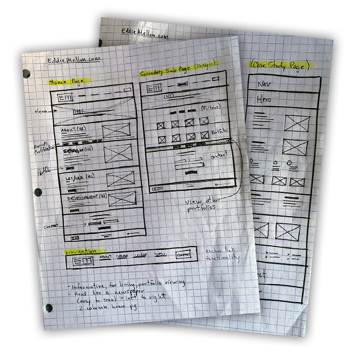
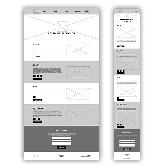
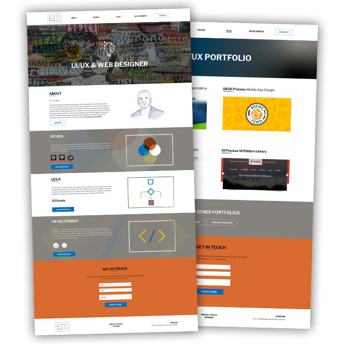
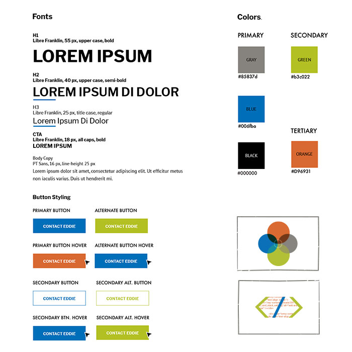
- Creating wireframes and mockups
- Rebuilding and reorganizing my website
Getting Started
I noticed quite a bit of contact form submission dropoff. I was receiving roughly 1 or 2 legitimate requests a month for freelance work. As well, I knew my website did not provide enough information or show the breadth of my professional work; as confimed by a high home page bounce rate (73%) and roughly two pages per user session and each session lasting a little more than 1 minute. Additionally, I was using my website to try and produce extra work for myself. I knew I needed to redesign the website, but wanted to make sure that I was focused on my end users.
That meant;
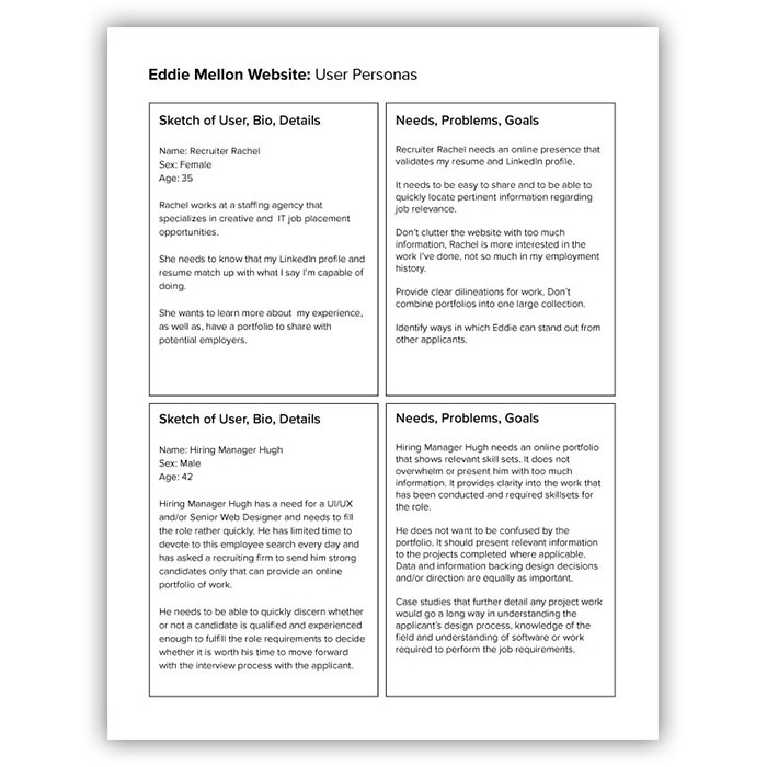
- Estalishing personas from reviews, research and interviews
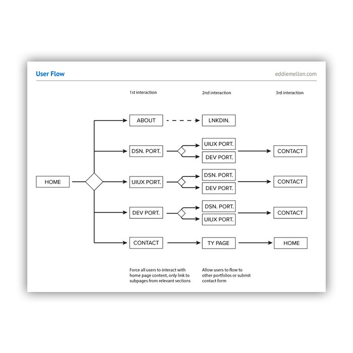
- Creating a strategy for the layout and userflow for the website
- Making the portfolios easy to filter and review
- Provide end users with pertinent information on my work and an easy way to contact me
Research & Strategy
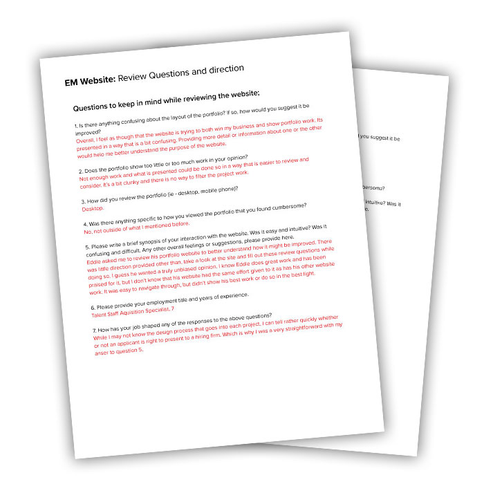
To start the research part of my project, I asked three former colleagues to review my website and identify areas that needed imrpovement. After those initial reviews were performed, I asked 3 other friends with no experience in UI/UX or web design to review my website. Finally, I asked two friends who work as recruiters to review my website for their input. From those 8 individual reviews, coupled with my analytics data, I was able to synthesize the information provided and establish a strategy for my website.
My four main goals for the new website were;
- Focus your website as a portfolio only and leverage your brand aesthetic
- Make sure there are easy ways to filter your portfolios
- Show more of your diverse skills and talents, don't limit your portfolio to one discipline
- Provide a link to your LinkedIn profile for easy reference
The Process
Results
Numbers via Google Analytics show an increase in pages/session, session duration and a decrease in home page bounce rate.

Increase in pages/session and session duration
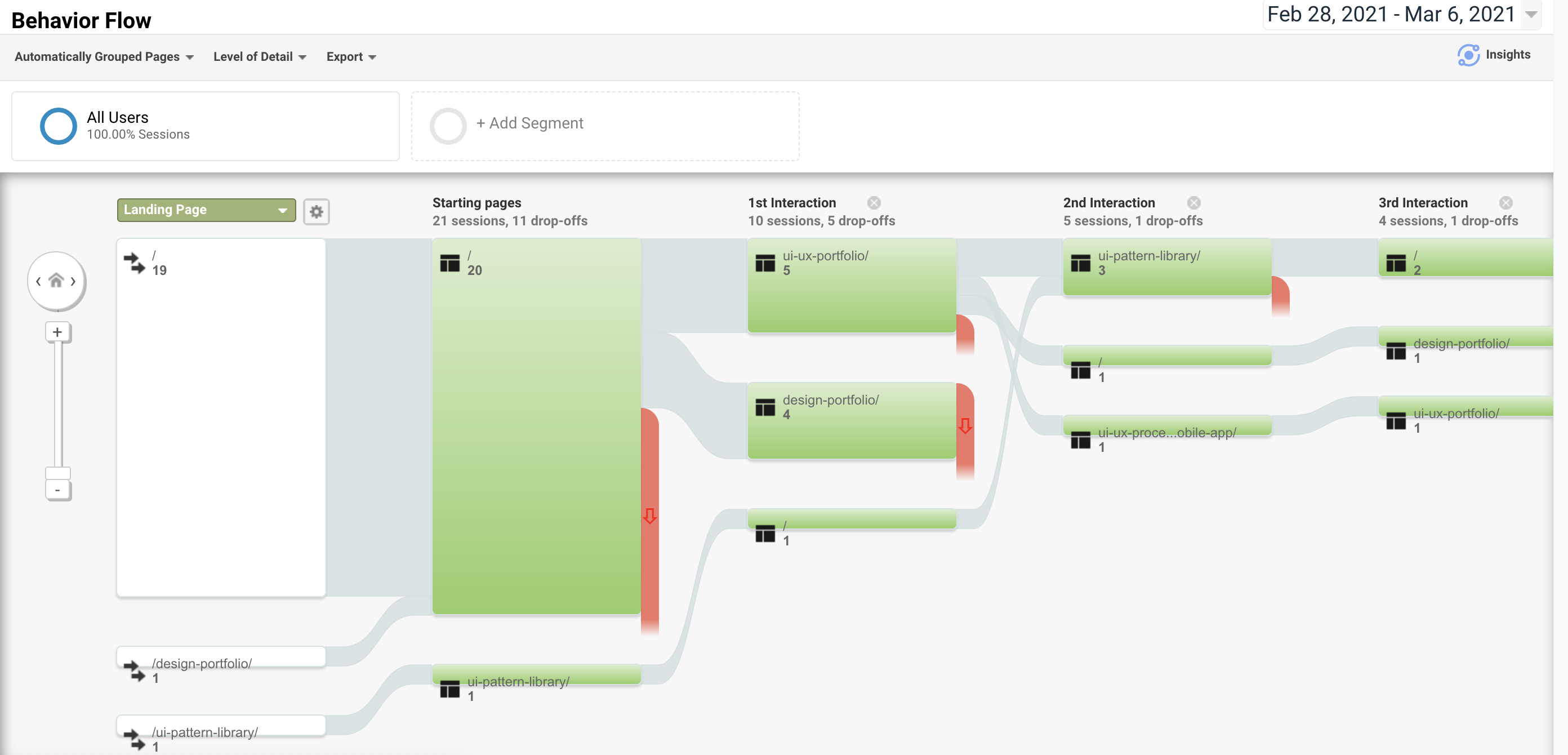
User behavior across pages shows users are interacting with more web pages
Get in touch

I work as a freelance designer in all of the above fields. If you’d like to discuss a project in more detail, feel free to drop a line. I love talking design.
