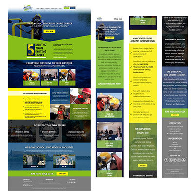
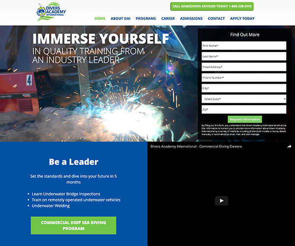
Case Study: Divers Academy
Website Redesign & Organization
Introduction
Divers Academy is an educational facility located in South Jersey that offers underwater training courses. The owner reached out to my former employer requesting assistance with a new website. As the UX Web Analyst, I sat in on the kickoff meeting with the client asking a number of general and specific questions to uncover how best to improve the website.
Primary goals for the new website;
- Reduce the number of phone calls going to the small sales team
- Increase qualified lead conversions through online forms
- Offer more streamlined navigation to educational pages
- Organize the website and its content for better SEO ranking

Getting Started
My role as the UX Web Analyst, was to focus on uncovering the underlying fundamental UI/UX issues while working alongside a team of marketing technology and content professionals, so we could organize a strategy for the website before starting on any aesthetics.
I performed the following steps before meeting with the team;
- Pull & review analytics with marketing tech
- Perform in-depth review of website content and navigation
- Uncover major UI/UX issues
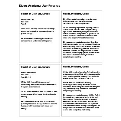
- Develop personas
- Formulate a UI/UX strategy that aligns with business goals
Research & Strategy
From my initial research, the website showed disorganization of information in the navigation and an overall lack of educational content. Additionally, the website did very little to leverage brand continuity across the website. Our internal team strategy meeting decided our best path for rectifying theses issues would be;
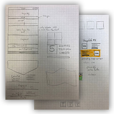
- Create structured, educational landing pages that incentivize website users to fill out forms
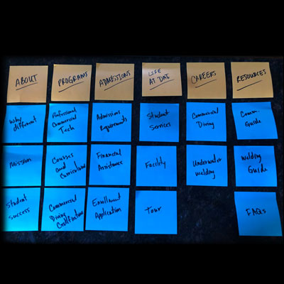
- Organize website information architecture for optimal navigation interpretation
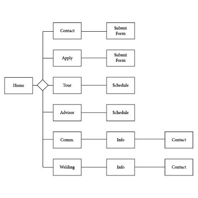
- User flow should direct visitors to a landing page or incentivized form to reduce questions
The Process
- ALL PROJECTS
Results
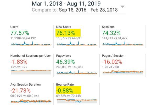
Users almost double from 64k to 113k
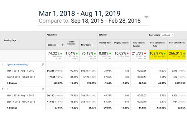
Large spike in form conversions
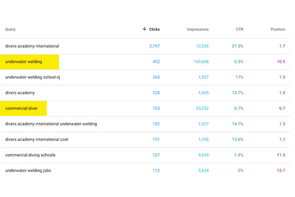
Divers was able to rank for a lot of high volume searches which are very competitive
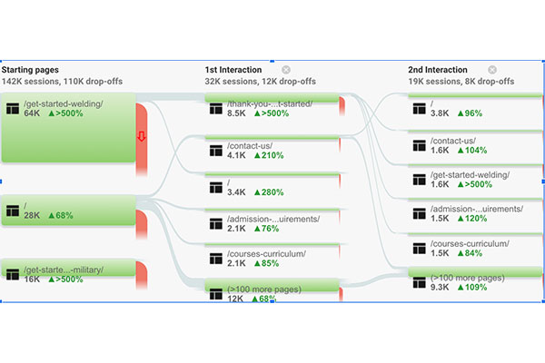
Users were converting at an incredibly high rate, meaning our UX improvements were working
Get in touch

I work as a freelance designer in all of the above fields. If you’d like to discuss a project in more detail, feel free to drop a line. I love talking design.
